Or, at least everyone knows what fonts are.
Since everyone and their brother (or sister) has a computer with Microsoft Word and Print Shop Pro Publisher Deluxe, we’ve all become skilled typographers, right?
Uh, no.
In an effort to educate the general Microsoft Office-using public, The Sacramento Bee offers What’s your type? (<-- This link is to the Printer version of the article, which apparently doesn’t force you to register in order to read the entire piece. You’ll have to click [Cancel] when the print dialog box comes up though.) In any case, give the article a read and get a glimpse of how the general populace views and uses fonts.
Thursday, December 27, 2007
Wednesday, December 26, 2007
Design, Spin, and “Greenwashing”
via e-mail from Roland
Have we gone wrong, design people? The New York Times’ article, Be It Ever So Homespun, There’s Nothing Like Spin muses on the design analog of what Michael Pollan described as “supermarket pastoral”—dressing up industrially-produced certified organic foods with green meadows and happy cows so we can feel good about our food choices. And here I thought we were only supposed to use the power of design for good.
Ignore, for the moment, the debate about the benefits (or not) of Big Organic vs. the accessibility (or not) of Sustainable Agriculture. Instead, check out the There’s Nothing Like Spin article to see how design influences the hearts and minds of supermarket shoppers.
Okay, back to my Natural Cheetos.
Sunday, December 16, 2007
Thursday, December 13, 2007
Ugly Colleges
via Daring Fireball
While there’s tons (literally) of construction going on around Cal, I think you’d be hard pressed to find someone who thinks the entire campus is ugly. Parts of campus? Definitely (Lower Sproul, anyone?). But the whole campus? No.
It seems like the writer of The 20 Ugliest Colleges in the USA seems to agree—Cal doesn’t appear on the list. The list is arbitrary, so take the selections with a grain of salt. I will, however, endorse the inclusion of selections 5 and 13. I’ve been to both campuses and would have been surprised if they hadn’t made the list.
Thursday, November 29, 2007
Why read it? See it!
via PopURLs
Happy post-Thanksgiving! Things have been pretty quiet around the ole blog what with the lead-up to Thanksgiving, Thanksgiving itself, and the trytophan– and shopping-induced post-Thanksgiving weariness that inevitably follows. With all this holiday lethargy around us, how can we possibly be expected to read things (like this blog) without falling asleep? I, for one, have no such expectations.
So, to ease oneself back into the fast-paced information age, today I’m recommending the Merriam-Webster Visual Dictionary Online. For instance, this is how they define uses for the Internet:
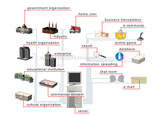
Isn’t that so much better than some long-winded explanation from an IT professional?
Hmmm, they don’t seem to have blogs on their pictogram anywhere… but they do have educational institutions, so I guess we’re covered.
Happy post-Thanksgiving! Things have been pretty quiet around the ole blog what with the lead-up to Thanksgiving, Thanksgiving itself, and the trytophan– and shopping-induced post-Thanksgiving weariness that inevitably follows. With all this holiday lethargy around us, how can we possibly be expected to read things (like this blog) without falling asleep? I, for one, have no such expectations.
So, to ease oneself back into the fast-paced information age, today I’m recommending the Merriam-Webster Visual Dictionary Online. For instance, this is how they define uses for the Internet:
Isn’t that so much better than some long-winded explanation from an IT professional?
Hmmm, they don’t seem to have blogs on their pictogram anywhere… but they do have educational institutions, so I guess we’re covered.
Thursday, November 8, 2007
Of Fawnt and dafont
via Daring Fireball (from a couple of weeks ago)
There was I time when I was crazy for fonts. I would collect and pore over the typeface catalogs from Adobe, Monotype, ITC, and Emigre and dream of the day when I would own every font in the world.
Nowadays, with everyone and their uncle (or aunt) creating fonts I’ve given up on my plans of world font domination. There’s also the fact that owning every commercially-available font would be prohibitively expensive and having zillions of fonts loaded on my computer would cause Adobe apps to take eight hours to open (Microsoft Word could take up to three weeks to launch).
But, for those of you still clinging to your font fetishes, here are a couple of sites to enable your addiction:
Fawnt.com
dafont.com
There was I time when I was crazy for fonts. I would collect and pore over the typeface catalogs from Adobe, Monotype, ITC, and Emigre and dream of the day when I would own every font in the world.
Nowadays, with everyone and their uncle (or aunt) creating fonts I’ve given up on my plans of world font domination. There’s also the fact that owning every commercially-available font would be prohibitively expensive and having zillions of fonts loaded on my computer would cause Adobe apps to take eight hours to open (Microsoft Word could take up to three weeks to launch).
But, for those of you still clinging to your font fetishes, here are a couple of sites to enable your addiction:
Fawnt.com
Fawnt is a font resource for designers, developers, and anyone that appreciates the web's highest quality fonts
dafont.com
Welcome. Here you can download fonts to use in your documents, create titles or logos.
I’ve perused both sites and have resisted the urge to download all the free fonts. I can just look at them and appreciate them. Yeah.
Well, maybe I’ll just try one.
Wednesday, October 31, 2007
One of our own

DevCom's Vee Mahoney is participating in the SF Open Studios this weekend:
November 3-4, 2007
11 am - 6 pm
Her work is on display in her studio in Building 116 at the Hunters Point Shipyard.
Way to go, Vee!
Tuesday, October 30, 2007
40% of us feel fine. 1,217 feel weird.
Pam Pfiffner at Creative Pro blogs about her design epiphany while visiting Adobe , where she gets synchronistically clued into a site called weefeelfine.org. Maybe it's the introspection of fall, but I feel compelled to look at the wriggling data points about feelings, or at least poke around to see all the ways the designer is presenting the data.
This beguiling site is “an exploration of human emotion on a global scale.” The site searches the blogosphere for instances of the words “I feel” or “I am feeling” and tracks the emotion attached to that phrase. The information is saved into a database that parses such information as location, age, and gender. Through a visual interface, site visitors can explore what people are feeling at any moment all over the world. Click on a dot representing a blog post and the “emotional” words in that blog posting appear. For example: “I feel like I don’t know how to have fun anymore.” Click those words and you’ll be taken to that person’s blog for more context.
Wednesday, October 24, 2007
Paul Rand said…

via Daring Fireball
I’m not familiar with The One Club, but I am familiar with Paul Rand. If you’re not familiar with Paul Rand (and you should be), you can read about him at Wikipedia.
If you’d rather see and hear about Paul Rand, though, you can watch this video created for Paul Rand’s induction into The One Club Hall of Fame.
Monday, October 22, 2007
“The Leopard, she is coming…”
Yes, that is my attempt at bad movie dialogue (à la The Night of the Iguana). But, hopefully you were able to read past the bad screenwriting and realize that it’s Mac OS X Leopard that is coming—on October 26th!
If you’ve already familiarized yourself with Leopard’s 300+ new features and gone through the guided tour, you can check out “Getting your Mac ready for OS X 10.5” at Macworld.com.
Actually, maybe you should make sure your Mac can handle the upgrade.
(The Scholar’s Workstation has Leopard available for pre-order. I’ve already got mine all lined up!)
Wednesday, October 10, 2007
Freelancin’ (mistakes)
via popurls
My first steps down this whole graphic design-type road were a string of desktop publishing-type jobs supplemented by freelance work. Later, I worked as a production artist-type at Huge Financial Institution of America (a pseudonym) and freelanced. Now, I devote my work week to the UC and when I’m at home—no freelance.
Why not? 1. I don’t want to. 2. I don’t have to. 3. You can’t make me.
I was never entirely happy performing freelance work. I just didn’t have the temperament for it. My Top 5 Biggest Freelance Mistakes from freelancefolder.com pretty much sums up why 4. I suck as a freelancer.
Wednesday, October 3, 2007
Reminder: Helvetica this weekend at YBCA

More information:
• This weekend's showings
• Helvetica web site
• Clips and trailers
• AIGA interview with director Gary Hustwit
• Previous DA post
Free MacWorld exhibit passes until October 5th
Free Exhibit Hall passes to MacWorld Conference and Expo are available until this Friday (10/05). Use code 08-E-VF01.
Register today!
Register today!
Tuesday, October 2, 2007
Wedding photos
via Daring Fireball
No, not from my wedding. Or, for that matter, anyone that I know. Anyway, it’s not the wedding that’s the matter of interest, it’s the photos. Actually, it’s the camera—a barely-in-the-wild High-ISO Nikon D3.
If you want to see some unretouched snaps from the nigh-latest in pro digital camera gear, head over to “Nikon D3 Test Drive.”
*sniff* Unretouched high-ISO digital photos always make me cry.
Tuesday, September 25, 2007
Quiddities to appear at upcoming Drupal meeting
via email from Tao Starbow, Webnet
Greetings Berkeley Druplers,
Our next meeting will be Thursday, September 27th, Noon-1:30pm at 290 HMMB, UC Berkeley (note the change of day from our usual Wednesday time slot).
This month: Developing Drupal Sites at UC Berkeley
Rob and Tracy, from Quiddities are going to talk about the sites they have developed at UCB (including the College of Arts[sic] and Science), the trials and tribulations of Drupal and the campus bureaucracy, and the CalNet authentication module they have been developing.
Also, the Bay Area Drupal Camp is coming to UC Berkeley in November. Register now.
Update: Rob & Tracy will not be talking about CalNet, but [Tao] will give a summary of the status of Rob Barreca's calnet.module (which is currently in at BigIdeas.berkeley.edu) and [] an overview of the steps needed to get a 5.x compatible release
Friday, September 21, 2007
Dr. Copperplate and Mr. Gothic
via Daring Fireball
Like many of us (I hope), I look back on much of my early graphic design—or, to tell the truth, desktop publishing (gasp!)—career with varying degrees of sheepishness and downright embarrassment. My greatest regrets: bad layouts and bad typography.
I used to chalk up my clunky typography to the clunky fonts at my disposal when a Macintosh IIfx, LaserWriter II, and PageMaker 3 were the high-end tools of the DTP trade: Avant Garde, Bookman, Courier, Helvetica, New Century Schoolbook, Palatino, Symbol, Times, Zapf Dingbats and Zapf Chancery. Later, I blamed my failure with Lithos on MTV’s beating of that typeface into the ground. Then, a long stint with what is now the US’s largest commercial bank left me irrationally angry at Futura Bold.
But, after reading through Armin Vit’s “Dr. Copperplate and Mr. Gothic”—a considerate view of Copperplate (another one of my font nemeses)—I’ve had to rethink the issues I’ve had with all the fonts in the past.
Maybe I just suck at setting type.
Thursday, September 20, 2007
Attractive… Charts?
via Smashing Magazine via popurls
Do you use Flash? (Me: A little.) Do you design charts? (Me: Sometimes.) Do you design dynamic charts in Flash? (Me: Wow, I never thought of doing that.)
And, with my mediocre Flash skills, I would never attempt making a dynamic chart in Flash.
Enter amCharts, the work of a seemingly lone, Lithuanian Flash developer. I won’t go into the details—Smashing Magazine already did: Attractive Online Diagrams, Charts And Maps. When you’re done reading about it, you can go to amCharts and download away.
Monday, September 17, 2007
Adobe Photoshop CS3 Extended for Apple iPhone

via Daring Fireball
(It’s not Friday, but it’s never too early for something fun, right?)
I don’t have Photoshop CS3 and I don’t have an iPhone. I hope someday to have both… but together?
A year of speakers on art, technology, and culture begins tonight

The first installment in this year's speaker program — "The Art, Technology, and Culture Colloquium," sponsored by UC Berkeley's Center for New Media — begins tonight.
Tonight's performance: Trevor Paglen explores state secrecy and the geography of nowhere.
7:30 – 9 p.m.
160 Kroeber Hall
For more information, see:
• Secret CIA Prisons in Your Backyard
• KQED's Spark* feature on Trevor in April 2006
• Trevor's bio
Atkinson Photographic Archive

The Atkinson Photographic Archive provides access to high-res photos of campus buildings for University of California-related purposes.
Note: Photo quality varies. Please read copyright instructions before using.
Photograph © 2003 by Alan Nyiri, courtesy of the Atkinson Photographic Archive.
Thursday, September 13, 2007
Free! Fonts!
via Smashing Magazine via popurls
Smashing Magazine is linking to six free (!) fonts and we’re linking to Smashing Magazine. I don’t know if you’d want to change the body copy of your entire newsletter-brochure-what-have-you to any of these free (!) typefaces, but any of them would work as a display face. Remember, “If it’s free, take one. If it’s free and not so good, take two.”
Smashing Magazine is linking to six free (!) fonts and we’re linking to Smashing Magazine. I don’t know if you’d want to change the body copy of your entire newsletter-brochure-what-have-you to any of these free (!) typefaces, but any of them would work as a display face. Remember, “If it’s free, take one. If it’s free and not so good, take two.”
Monday, September 10, 2007
Book production basics
per BBW e-mail:
Bookbuilders West Presents:
Annual Crash Course in Book Production Basics 2007
Thursday, October 11th, 2007
Registration: 8:15 - 8:45 am
Presentations: 9:00 am - 4:00 pm
Grosvenor Hotel, 380 So. Airport Blvd., So. San Francisco, CA
See below for directions or phone (650) 873-3200
$75.00 Members | $65 For members with 4 or more attendees |
$95.00 Non-members
Register Now!
This course provides an introductory overview of the entire book publishing production process including editing, design, composition, art and photo preparation for 1-, 2-, and 4-color printing, binding, and paper selection. Interested in learning about new media technologies? Information about creating various media projects in conjunction with print projects will be addressed as well.
Lunch and course materials will be provided.
Registration Deadline: October 4th, 2007
(No refunds or cancellations; substitutions are welcome.)
If you have questions about registration or payment, please contact Mike Johnson by sending email to MJohnson@edwardsbrothers.com, or calling 951-587-8728.
Friday, September 7, 2007

Thursday, September 6, 2007

Wednesday, September 5, 2007

Tuesday, August 28, 2007
Berkeley honored with art
via sfgate.com

Colombian artist Fernando Botero has chosen Berkeley as permanent home to his compelling Abu Ghraib paintings. However, details of the agreement need to be worked out before it's a done deal. The Center for Latin American Studies sponsored the only American showing of Botero's images of Abu Ghraib prisoners earlier this year.
Colombian artist Fernando Botero has chosen Berkeley as permanent home to his compelling Abu Ghraib paintings. However, details of the agreement need to be worked out before it's a done deal. The Center for Latin American Studies sponsored the only American showing of Botero's images of Abu Ghraib prisoners earlier this year.
Latin America's most celebrated living artist, Botero has offered to give the university all the pictures it displayed — 25 big paintings and 22 drawings of bound, bloodied and blindfolded naked prisoners, one pawed by a ferocious dog. They're based on the photographs and stories of Iraqi prisoners tortured by U.S. soldiers at Abu Ghraib prison in Iraq. Berkeley chancellor Robert Birgeneau has tentatively agreed to accept the gift, the monetary value of which experts peg at $10 million to $15 million....
In April, the artist, who lives mostly in Paris, e-mailed Professor Harley Shaiken, director of the Center for Latin American Studies, who had organized the show, to say he'd decided to give the works to UC Berkeley. He wrote that because of the school's academic stature and "openness of spirit," he wanted the pictures to reside there permanently.
"We were stunned. It was well beyond our wildest dreams," said Shaiken, who relayed the offer to the chancellor, whom he praises for taking the risk of showing these provocative works and supporting the belief that "a university deals with ideas."

Wednesday, August 15, 2007
Typesetting in the 70s, Part One
For those who weren't there to see it in all its glory, here's a chance to get a glimpse of what the 70s looked like, by and large, graphic-design wise. Creative Pro just posted the first of a series and I think the images and the technical background he offers about why things looked the way they did is fascinating.
Scanning Around With Gene: Part 1 of That '70s Type!

Some of you may know that I think there is a dearth of understanding amongst the younger digirati of what design really entailed before PostScript. I think I'm secretly soliciting stories from the trenches from those who know what collodion is. I didn't. At least not until a heart to heart with an elder pressman at the press check on Monday. And Scitex?
What do you guys think? When the car was invented, did we really need to teach our children about the details of horse husbandry? Or did we say, let bygones be bygones and let the knowledge fade into the ether?
Scanning Around With Gene: Part 1 of That '70s Type!
Some of you may know that I think there is a dearth of understanding amongst the younger digirati of what design really entailed before PostScript. I think I'm secretly soliciting stories from the trenches from those who know what collodion is. I didn't. At least not until a heart to heart with an elder pressman at the press check on Monday. And Scitex?
What do you guys think? When the car was invented, did we really need to teach our children about the details of horse husbandry? Or did we say, let bygones be bygones and let the knowledge fade into the ether?
Tuesday, August 14, 2007
Helvetica comes to you
via Daring Fireball
If you haven’t seen Helvetica (the movie), the next geographically-convenient showing will be at the Yerba Buena Center for the Arts from October 5–7. Design Alliance movie night, anyone? Barring that, you can get the Helvetica (the movie) DVD in your hot little hands after November 6th (Pre-order here).
I haven’t heard any firsthand reviews, but Helvetica has been getting some good press online. All I know is that the movie posters are cool.
Monday, August 13, 2007
[Insert iLife ’08 pun here]
Apple’s new iMacs are all shiny aluminum and glass but I was actually more interested in the revamped iLife ’08—and, to a lesser extent, iWork ’08—application suites. If you haven’t seen Real Steve Jobs do his iLife and iWork ’08 demo yet, you can watch the whole spiel in streaming QuickTime—the iLife ’08 part starts at around 13'30".
If you’d rather read about initial impressions of the new iApps (is that what we should call them?), head over to Macworld’s first looks at Numbers, GarageBand, Keynote, iPhoto, Pages, iMovie, and iDVD.
I’ll save the iLife pun for later. Something like “iLike iLife, uLike iLife 2?”
Edit: Added iMovie and iDVD. —calixton
Wednesday, August 8, 2007
Singin Along Cause I'm So Design Gangsta
A quick and nerdy deliverable for you courtesy of Kyle Webster and You Tube. I really can't get the tune out of my head.
"Press Check!" "CMYKaaaaaay!"
youtube.com/watch?v=yJexyQT0l1c
"Press Check!" "CMYKaaaaaay!"
Tuesday, August 7, 2007
Apple Inc. turns its attention to… the Mac?
Windows-only readers can skip this post.
For those of you wondering if Apple Inc. still makes computers, today’s special Apple Mac Event was a celebration of (almost*) all things Mac.
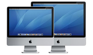
The first announcement was the new iMac form-factor. Thinner, sleeker, faster, shinier—the new, aluminimum-clad, 20– and 24-inch iMacs run Intel Core 2 Duo processors from 2.0 to 2.8GHz. Still no built-in Blu-ray burner, but I want one of these new iMacs almost as much as I want an iPhone. The keyboard alone is a thing of beauty.
Despite the new hardware offering, the bulk of the Mac Event time was devoted to iLife and iWork. iLife ’08 has significantly updated versions of iPhoto, iMovie, iWeb, iDVD, and GarageBand (where’s the “i”?). iWork ’08 has revised apps Keynote (presentations) and Pages (word processing), and adds a new spreadsheet application, Numbers. I’ve never been excited about presentations, word processing, or spreadsheets, but I’m beginning to feel some tingling in the extremities.
Finally, .Mac (Apple’s e-mail and online tools service) got a storage and functionality bump (to integrate with iLife ’08), and the Mac mini got a silent processor upgrade.
Now when will TSW get all this new stuff?
*No Mac Pro, MacBook, MacBook Pro, or Xserve news.
Monday, August 6, 2007
Animator vs. Animation
I saw this animation over a year ago and got a kick out of it then. Many of you have probably seen it before but if you haven't, then you'll be entertained. I found it to be very clever - if you've ever worked in Flash you'll get an extra laugh. And, there is a sequel (although, I think the first one is still the best).
Animator vs. Animation
Animator vs. Animation II
Animator vs. Animation
Animator vs. Animation II
Thursday, August 2, 2007
Wednesday, August 1, 2007
Cal WebFiles: who knew this existed?
Say you have a client who for some [f... rustrating] reason can't access your department's FTP site (this has happened to me recently) — well, check this site out: webfiles.berkeley.edu.
Believe it or not, Cal WebFiles is hosted on campus, and is available to all students, faculty, and staff. Cal WebFiles provides web publishing, file storage, and file sharing.
To start using WebFiles, here's a quick tutorial:
(1) Create your own account.
(2) Upload a file you wish to share with your client.
- Click "Upload"
- Select "Number of files to upload" (at right)
- Choose file(s)
- Click "OK"
(3) Send an email with link to file to your client.
- Check box next to file you want to send
- Click "Email Icon" in menu bar
- Select "Ticket"
- Click "Email"
- Address email and add any additional copy
- Send email to your client
See also:
Monday, July 30, 2007
This (Flash) I Like
via popurls
I'm not a big fan of Flash, especially for user-interface. But, sometimes it really, really works to get a point across. My favorite current example:
What Excessive Pay Package?
I'm not a big fan of Flash, especially for user-interface. But, sometimes it really, really works to get a point across. My favorite current example:
What Excessive Pay Package?
Monday, July 23, 2007
DESIGNERSLASHMODEL
via Roland via e-mail
Design Alliance:
This is interesting and ghastly at the same time:
“Do I create beautiful work because I am beautiful, or am I beautiful because I create beautiful work?”
designerslashmodel.com
Monday, July 16, 2007
Official Berkeley colors
via Webnet
A few minutes ago, I received the following email from a member of Webnet:
Here was a reply from another member:
Looks like we should update the identity site to reflect PMS, CMYK, and RGB recommendations, for both print and web.
A few minutes ago, I received the following email from a member of Webnet:
Can anyone point me to where the official Berkeley colors -- in CMYK and RBG -- are posted, or direct me to someone who would know what they are?
I've visited the Identity Resources page (identity.berkeley.edu) but only see guidelines for the seal, signature, typeface, and format.
Here was a reply from another member:
I don't have the CMYK or RGB values handy, but someone inquired about "official" PMS colors recently. Here are some combinations that are typically used:
These are typically used for the seal:
540 (blue)
139 (gold)
540 (blue)
874 (metallic)
These are used when brighter colors are required, e.g., for athletics:
287 (blue)
1235 (gold)
288 (blue)
1245 (gold)
Looks like we should update the identity site to reflect PMS, CMYK, and RGB recommendations, for both print and web.
Friday, July 13, 2007
Friday Movie Matinee

Here’s a little Friday movie-viewing pleasure for you, Copy Goes Here. (Yes, this is design-related.)
Thursday, July 12, 2007
Fonts that I hate but have been forced to use
1. Optima -- awful in most contexts, and it was being used all over the place at my office at Berkeley when I started. I think it looks good when used well -- most often in 1970's science textbooks. My phase-out is 60% complete, and I look at it's elimination as a meaningful legacy to my time spent here.
2. Frutiger -- A signage font that shouldn't be used elsewhere unless you know what you're doing. Also in use at my current job
3. Ariel -- I frequently have to design MS Word forms or powerpoint things for people who are presenting on unpredictable machines. Ariel sucks but is reliable. Simonson really hates it.
4. Palatino -- I guess Zaph re-cut this recently (now called Palatino Nova). I've had to use the regular one as a text/body type frequently and hate working with it. Not the most readable, and not especially flexible with spacing. For the record, though, the old hot metal version that Zaph made looks nice.
... but on a positive note, I love the Glyph window in illustrator/indesign. Even fonts I hate have some lovable characters hidden inside (Nice smiley faces, Times New Roman.)
Wednesday, July 11, 2007
In or Out of Focus?

Photography that represents the University as a whole (the sum of its many diverse parts) has also been on our work radar since spring.
Any of you who alter photos in Photoshop (who doesn’t?) might have liked the Peter Henry Emerson (1880-1895) exhibit I saw at the J. Paul Getty museum in May featuring his early photography from Eastern England.
As suspected, the alteration of negatives has been going on from the get-go. I saw the variations of prints from altered negatives. The big debate then was about “truthfulness” vs. “character of nature” in photography. Whether photos should be sharply in focus capturing detail with startling clarity, or more fuzzy, closer to what the human eye sees. These were quite heated salon discussions.
Quotes from the time:
“Negatives must be printed without alteration.”
“Nothing in nature is a hard outline, but everything is seen against something else, often so subtly you cannot quite tell where it ends and the other begins. In this mingled decision and indecision lies all of the charm and mystery of nature.”
“Remember that your photograph is a rough index of your mind, it is sort of a rough confession on paper.”
Due to my procrastination in posting the show is gone but here is a link to the highlights: www.getty.edu/art/exhibitions/emerson.
Favorite fonts of… 2006?
via typographica.org via popurls
When I first stumbled on this typographica.org post I thought, “Wow, it’s kinda late in 2007 for a 2006 list.” But, with the sheer number of cool (and useful) fonts highlighted I can hardly blame them.
While University Old Style is our house typeface and one of UC Berkeley’s identifying components, there’s got to be room in your font toolbox for some of Typographica’s Favorite Fonts of 2006.
Interact 10 Ways

Okay, I've been finding all kinds of excuses not to post. I thought I’d be the first one in July but Calixto beat me to it. Since what I’m currently working on consumes my waking moments and prevents me from blogging, I’ll just share it.
While searching for inspiration on the web front for possible ways to engage our audiences. I came across this fun, visually experimental media site. Several design groups collaborated with Gettyone to create it. You’ll need some time. Each of the 10 pieces takes a minimum of a few minutes to experience. Let me know which one(s), if any, you like. And which one(s) kept your attention the longest! www.interact10ways.com
Tuesday, July 10, 2007
Google Office
via Macworld
No, I don't mean Google (verb) Office (direct object). I mean Google Office—like Google’s answer to Microsoft Office. Actually it’s called Google Docs & Spreadsheets BETA (catchy, right?) and you can read more about it at Macworld. I’ve played with this Google Documents & Spreadsheets BETA a little bit and it has some interesting features. If anyone wants to try editing a shared document remotely in real-time, give me a jingle at calixton@youknowwhere.edu.
Yes, it’s not really design-related but everyone’s just coming back from vacation so it might be a while before the “design” posts come back in full force.
(First July post!)
Thursday, June 21, 2007
Dude, so OMG (JK, LOL) et al.

Presidential hopefuls notwithstanding, Kaplan may have topped the chart for the lamest myspace friend ever*.
All LOL's aside, this is pretty much an ad for Kaplan's new line of ipod based test prep materials -- which led me to wonder if there's a point where some of us academic design types will have to start making interfaces for ipod course guides. Or how about campus maps? The 2009 catalog?
Maybe I'm just jealous because Kaplan has 960 more friends than I do, but designing for ipods sounds like kind of a drag.
*While Kaplan is by far the worst, on the other end of the spectrum Gabe Kaplan could be the best friend you'll ever have.
Got coprolite?
via an e-mail to Webnet from Claudia Morgan, Web & Multimedia Coordinator, HRB Communications, UCOP
Sometime back I asked for questions to ask prospective web designer candidates. I received a number of good suggestions (thanks!) and have been asked by other members of this listserv—who were also hiring—for a list of these suggested questions.
Well, I want to add to the list an article I found (with the introduction):
Let's discuss amongst ourselves. Do you agree with Rose Pruyne?
Sometime back I asked for questions to ask prospective web designer candidates. I received a number of good suggestions (thanks!) and have been asked by other members of this listserv—who were also hiring—for a list of these suggested questions.
Well, I want to add to the list an article I found (with the introduction):
The Web Professional Test
I’m of the mind that those of us who are Web professionals should be tested as part of qualifying for our jobs. Just as writers and others are.
The days are over (in truth, they never really started) when it worked to equip the inexperienced with WYSIWYG editors and turn them loose on the Web.
Web professionals need to perpetually cultivate a broad and in-depth skill set. If you are not motivated to do this, you quickly become a technological coprolite.
And while the specifics depend to some extent on the size and composition of the Web team, the more you can offer, the better.
So in addition to the usual interview questions, here is how I would test: More >
Let's discuss amongst ourselves. Do you agree with Rose Pruyne?
S'mores and kerning
I thought I was kind of a nerd, but at least I'm not showing up to this (full disclosure: I did, however go here.)
Alternately, check out FONTSELF. This is a pretty alpha project that seems to be aimed at providing the ability to create fonts that preserve the gestures of a given handwriting and the original look of the drawing appliance (ball-point pen, pencil, ink, paper, etc.)
Looks like they're promising an online tool for uploading drawings, adjusting metrics and kerning, and possibly an adobe plug-in for using the faces off of the interweb. As of now, you can look at it online and wish that it existed -- like the iPhone!
Friday, June 15, 2007

Thursday, June 14, 2007
Love The Tufte
via New York Magazine via popurls
I like to think of Edward Tufte as simply The Tufte. I don’t do this to demean him (‘The Tufte’ being aurally akin to ‘The Hoff’); it’s more of an expression of “He’s the man.” Again, in a positive sense, not in a socio-oppressive sense. Okay, that’s too much explanation.
Anyway, if you’d like to read more about The Tufte, his charts, his fans, why he thinks PowerPoint is evil, etc., head on over to Beautiful Evidence at New York Magazine.
UPDATE: And, as Kathryn pointed out, Tufte is coming to town.
Wednesday, June 13, 2007
Safari, Windows, Apple, Microsoft, font rendering
via popurls
Now that Apple has made their Safari Web browser available for Windows (Why? Macworld proposes at least two reasons), you can see on-screen font rendering Apple-style vs. Microsoft-style side-by-side.
To see the comparison, you’ll have to be using Windows XP or Vista and have downloaded the respective Safari 3.0 beta. Then, just launch Safari and Internet Explorer, go to the same Web page and compare. Side-by-side.
Or, you can just read this article at Joel on Software.
Tuesday, June 12, 2007
WWDC Keynote yesterday, DA meeting today!
If you were underwhelmed by Steve Jobs’ keynote at Apple’s Worldwide Developer Conference (WWDC) yesterday, then perhaps today’s Design Alliance meeting from 12–1:30 p.m. will add some excitement back to your life.
(Really, the “new” features in Leopard didn’t wow you? EA Games on Mac OS X? No? What about Safari on Windows? Not really? Wow. Tough crowd. Okay, see you at the meeting.)
(In case it’s not clear, Steve Jobs is not coming to the DA meeting. Just wanted to make sure my potentially misleading headline wasn’t actually misleading.)
Monday, June 11, 2007
Design Alliance meeting tomorrow
Okay, folks,
I’ve decided to make up for last week’s short notice in announcing tomorrow’s Design Alliance meeting—
I’ve decided to make up for last week’s short notice in announcing tomorrow’s Design Alliance meeting—
June 12, 2007
12–1:30 p.m.
Residential and Student Services Programs
2610 Channing Way (just up from Bowditch)
4th Floor Berkeley Room
—by making constant reminders of said upcoming meeting.
In case you didn’t get Friday’s reminder/update, here’s some of what the meeting will include:
- A presentation from the 2006 CASE Design Institute, “Visual Branding: Centralized and Decentralized Models”
- A revisit of a question from last year’s Design Alliance general meeting, “How can the Design Alliance serve you?”
- A discussion on Design Alliance forays into electronic communication
Okay, just eight or ten more reminders to go before tomorrow’s meeting. ;-)
Thursday, June 7, 2007
"think with the senses, feel with the mind"
The Venice Biennale just opened!!
Romanian artist, Dan Perjovschi, who makes drawings with markers on Museum walls, is included in the Biennale and can be seen here drawing at the MOMA in NYC.
If you scroll across the bottom of the Part II video of him, there's a nice video of Barry McGee working as well.
Not sure of the relevance of this all but Calixto is not in today so I'm going art wild!

Wednesday, June 6, 2007
Adobe Reader Prints to FedEx Kinko’s
via Macworld
As a former member of the Amalgamated Coworkers Kinko’s Federation United* (ACKFU) my nose hairs stand on end whenever there’s a whiff of FedEx Kinko’s in the air. Today my olfactory danger sense is piqued by the scent of “Adobe, FedEx Kinko’s pair up to ease doc printing.”
So how have these two (three?) companies eased up document printing?
With a button—[Send to FedEx Kinkos].
It actually sounds like it might work.
*ACKFU is not a real federated union. Acronym is not based on any organization, living or dead.
Tuesday, June 5, 2007
Next Design Alliance meeting: June 12th
Greetings, all,
Sorry for the short notice, but the date has been finalized for the next
Design Alliance meeting!
Set your calendars for:
Sorry for the short notice, but the date has been finalized for the next
Design Alliance meeting!
Set your calendars for:
June 12, 2007And your maps for:
12–1:30 p.m.
Residential and Student Services ProgramsYes, folks, that’s next Tuesday. An agenda for the meeting is coming soon.
2610 Channing Way (just up from Bowditch)
4th Floor Berkeley Room
Logo Drama Unfolding
The thrill of victory. The agony of defeat. What will it be? And more to the point, What the heck is that thing?
At least it's a design drama that's hitting the mainstream press (BBC News) and the underground (and dangerously risque) design blogs (like London's b3ta) alike. In fact, someone is already compiling the press response.
Most impressive, in terms of the power of design, is that medical experts are theorizing that the logo may induce epileptic fits.
Friday, June 1, 2007
Google Maps sees all…
…in even greater detail.
This one’s probably old news by now, but in case you haven’t been checking the Interwebs lately, the latest cool/privacy-shatteringly-frightening tool to come from Google is Street View.
Street View is part of Google Maps, and before you can say “Oh yeah, I saw the satellite photo thing, like, a year ago” let me point out that Street View was just launched this week. And, before you can ask “Okay, smart guy, if Street View isn’t the satellite photo thing, then what is it?” let me provide you with two links:
Reactions in the office have ranged from mildly amused to completely horrified to consumed with chafing and rage (though that may have nothing to do with Street View).
Wednesday, May 30, 2007
Grade Your Website
via del.icio.us via popurls
Do you build Web sites and pages? Do you toss and turn restlessly in bed at night, wondering if your code is XHTML-valid, accessibility-compliant, and current-browser-friendly? Do you gnash your teeth and rend your garments when you get an e-mail complaining that there’s something wrong with your Web site?
If so, you need to ease up a little.
In the meantime, you can use some of the 31 Free Online Tests compiled in one handy-dandy post at Aviva Directory. The 31 tests are broken into 5 categories: Code Validation; Accessibility; Speed; Browser Simulators; and, Search Engine Optimization.
Now you have no excuse for non-valid, non-compliant, non-friendly, gnash- and rend-inducing code.
Thinking and Making
This transcript is from
William Drentell and Jessica Helfand's talk
given at the '03 AIGA Conference "The Power of Design."
Maybe you've already seen it, felt it, know it...
I ran across it the other day while digging around and realized
I LIKE using my head AND my hands...what about you?
William Drentell and Jessica Helfand's talk
given at the '03 AIGA Conference "The Power of Design."
Maybe you've already seen it, felt it, know it...
I ran across it the other day while digging around and realized
I LIKE using my head AND my hands...what about you?
Tuesday, May 29, 2007
Pie Charts of the World
via del.icio.us via popurls
Have you heard of COLOURlovers? Yeah, me neither. At first blush, it seems to be a site where people discuss, well, colour trends (or here in the U.S., color trends). But, it’s not the esoteric discussions of ‘which beige is the new beige?’ that brought COLOURlovers to my attention. No, it was this:
Flags of the World by Color Usage
Now that, my friends, is a worthy usage of Microsoft Chart. (Ron, Roland, I challenge you to figure out which chart is for the RP—I got it in one try.)
Thursday, May 24, 2007
A Few Campus Aerial Panoramas
Hold on to your Aeron, these panoramas may have you looking for your landlegs. As Kathryn wrote, "It's wild, if you get the photo spinning. Don't drink and eye at the same time." :)
Stanley Hall of Biosciences, under construction in 2006
A brief index of more campus and local panoramas
I'm suddenly a huge fan of kite photography and the work of this Berkeley professor/photographer. Have fun!
Stanley Hall of Biosciences, under construction in 2006
A brief index of more campus and local panoramas
I'm suddenly a huge fan of kite photography and the work of this Berkeley professor/photographer. Have fun!
Client woes
Here's another site along the lines of AdVerbatims that may cheer you up if you think dealing with your client is a challenge. ClientCopia.com
Wednesday, May 23, 2007
chats within blogs about new 3D mice
B: I just got a cool demo of something you should post on the design alliance site
it's a cool 3D mouse that is especially cool for using the new 3D features in Photoshop. The thing to post would be the idea that, increasingly, stock photography may become less useful to designers than stock 3D objects. There's so much free 3D stuff out there that it's practical start thinking in terms of 3D images rather than still images. For example...
...say you need a shot of a football. You look all over and find a lot of stock photos of footballs, but none of them quite match your design. Instead, you get get a stock 3D model of a football, and position it exactly the way you want it.
2:45 PM
K: Does Getty One, et. al. have those 3D models you're talking about?
B: http://sketchup.google.com/3dwarehouse/
that's just google. There are lots and lots of other stock model places
K: So the mouse lets you drag things around in a "3D" space? Instead of using clicks to switch dimensions?
B: In Photoshop now, you can bring a textured 3D object into a photoshop document. It sits in its own layer and you can rotate and move it in 3D space. This mouse thing that they gave me provides a VERY intuitive way of navigating 3D space and manipulating 3D objects.
2:50 PM
K: Nice. Thanks!
Oh, how much is it?
B: (3dconnexion.com) // 59 bucks
K: Even nicer.
Tuesday, May 22, 2007
An Incomplete Manifesto
Bruce Mau's "An Incomplete Manifesto for Growth"
is an inspirational guideline for creativity...
and browsing back through the rest of Bruce Mau Design and Massive Change's site might partially satisfy Roland's desire to see designers get more involved in designing the world...
is an inspirational guideline for creativity...
and browsing back through the rest of Bruce Mau Design and Massive Change's site might partially satisfy Roland's desire to see designers get more involved in designing the world...
fer•ma•ta
The 37th Annual University of California, Berkeley Master of Fine Arts Graduate Exhibition opened Friday at the Berkeley Art Museum gallery.
Though I admit to mostly talking and drinking wine at the reception and so have minimal to say at this point about the art itself, I intend to return to BAM to check out more seriously the work of Berkeley’s most recent crop of artists graduating from Art Practice.
One artist completing the MFA program this spring, Ali Dadgar, was previously featured on the cover of the Promise of Berkeley Winter 2007 issue (PDF available). For his MFA exhibit he has reconfigured a computer printer to print with silkscreen inks on found and generated materials exploring “decorative censorship” in multiple cultural contexts.
50 Logo Design Tutorials
via del.icio.us via popurls
I’m not suggesting we go all willy-nilly making logos. On the contrary, I think the UC Seal, Berkeley signature, and University Oldstyle typeface are the only key elements we need to represent virtually anything related to the campus (yeah, yeah, send all complaints, flames, etc. to calixton@[thatplaceweallworkat].edu). But, it’s good to see how other creative-types do their work, what their process is, etc.
E Logo Design has compiled a list of “Top 50 Logo Design Tutorials” on their site. Some of the logos are great. Some of the logos are hideous. Some of the logos aren’t actually logos. Same for the tutorials (great, hideous, not tutorials, etc.). But, why just sit here and read about the list? Judge for yourself.
Monday, May 21, 2007
Speaking of accessibility...
via forwarded e-mail by Lucia Greco, Assistive Technology Specialist,
UC Berkeley:
Subject: Oracle sued by blind workers in Texas
The National Federation of the Blind and three blind State of Texas employees filed a lawsuit this week against Oracle and the State of Texas. The suit claims that they were not provided adequate access to software used in their employment functions. Despite a state law and guidelines requiring accessible software and after several complaints and requests for a remedy, the State of Texas and Oracle did not take adequate measures to provide screen reader access to the Oracle software that is required in the plaintiff's employment.
This lawsuit is somewhat different from the Target lawsuit. This case focuses on the accessibility of software, not specifically web content. However, it may provide a test of state accessibility legislation that requires "the same access to electronic and information resources as state employees and members of the public without disabilities." It is interesting that both parties of the State of Texas and Oracle are named in the suit. This may suggest that Oracle overstated it's accessibility and that the state did not adequately meet it's own internal policies in the state procurement process.
For more information, see: webaim.org/blog/2007/02/07/oracle_lawsuit.
For more about the Target lawsuit, see the NewsCenter's interview of the UC Berkeley student who filed the lawsuit here. (Be sure to read the informative sidebar.)
Web accessibility 101
via Debra Goldentyer, Webnet:
Join us on Tuesday, May 29, for what's sure to be an interesting conversation on Web Accessibility.
Why does it make sense to (re)design your website with accessibility in mind early in the process? In the words of one campus web developer:
Easier site changes? Less time and therefore less expense? Yes. And you get accessibility too? What? Doing the right thing saves money? YES! So, why not make your website accessible?
WebAccess, the campus web accessibility group, will review Section 508 standards and W3C guidelines on web accessibility as well as the campus commitment to technology accessibility. Then they'll take you though a WebAccess clinic, where they'll be evaluating a newly designed campus website from an accessibility point of view.
Helpful links to get you started:
(Re)designing your website with accessibility in mind:
istpub.berkeley.edu:4201/bcc/Spring2007/993.html
Tips for improving web accessibility:
istpub.berkeley.edu:4201/bcc/Fall2006/927.html
Tips for improving web accessibility — round 2:
istpub.berkeley.edu:4201/bcc/Spring2007/991.html
Got a conflict? Can't be there? Contact Dianne Walker, WebAccess Lead, for more information.
Join us on Tuesday, May 29, for what's sure to be an interesting conversation on Web Accessibility.
Date: Tuesday, May 29
Time: 12 noon to 1:30 pm
Place: 150 University Hall. NOTE ONE-TIME CHANGE OF VENUE
Speaker: Dianne Walker, Project Engineer, IST, and the Web Accessibility Group
Topic: Web accessibility at Berkeley
Why does it make sense to (re)design your website with accessibility in mind early in the process? In the words of one campus web developer:
- You're going to be changing all that code anyway as part of the redesign; why not do it the right way, and start from the ground up with accessible practices?
- Adhere to web standards, and accessibility will be almost automatic. Plus, your site will be far less likely to encounter problems with current or future web browsers.
- Making your site as accessible as possible to disabled visitors also means improved accessibility for web crawlers, spiders, and bots. The likely result: Improved rankings with Google and other search engines.
- If you follow best practices like semantic markup (using the proper HTML element for each type of content) and separating content from design (via CSS), you may have a higher learning curve at the beginning if you've not done this in the past. But future site changes will be vastly easier because of the structure you will have put in place. In fact, if you plan things right, you could completely change the appearance of your site next year or next month without having to open and modify any of the pages; just tweak the CSS stylesheet.
Easier site changes? Less time and therefore less expense? Yes. And you get accessibility too? What? Doing the right thing saves money? YES! So, why not make your website accessible?
WebAccess, the campus web accessibility group, will review Section 508 standards and W3C guidelines on web accessibility as well as the campus commitment to technology accessibility. Then they'll take you though a WebAccess clinic, where they'll be evaluating a newly designed campus website from an accessibility point of view.
Helpful links to get you started:
(Re)designing your website with accessibility in mind:
istpub.berkeley.edu:4201/bcc/Spring2007/993.html
Tips for improving web accessibility:
istpub.berkeley.edu:4201/bcc/Fall2006/927.html
Tips for improving web accessibility — round 2:
istpub.berkeley.edu:4201/bcc/Spring2007/991.html
Got a conflict? Can't be there? Contact Dianne Walker, WebAccess Lead, for more information.
Thursday, May 17, 2007
Outing Fake Steve Jobs
Well, this post is decidedly "loft-less". But I hope it is amusing for those Apple aficianados and culture vultures amongst us.
Insiders say they're closing in on the culprit behind the Fake Steve Jobs blog.
Insiders say they're closing in on the culprit behind the Fake Steve Jobs blog.
Wednesday, May 16, 2007
MacBump Speedbook
Would you like to do your computing-on-the-go a little faster? If you’re in the market for a new Mac laptop you can get in on the ground floor of the latest round of MacBook processor speed boosts (now at 2.0GHz and 2.16GHz). You can read more details at Macworld.
Oh, can faster MacBook Pros be far behind? I really, really hope so.
Oh, can faster MacBook Pros be far behind? I really, really hope so.
Monday, May 14, 2007
Comic Sans has a lisp?
It’s (still) Helvetica’s birthday! Following up on our posts about the BBC News magazine story and Helvetica the movie is this Sheldon strip by Dave Kellett.
Hmmm… what would Helvetica look like as a comic-strip character?
[first seen at Daring Fireball]
Hmmm… what would Helvetica look like as a comic-strip character?
[first seen at Daring Fireball]
Friday, May 11, 2007
Drupal update
via Tao Starbow, Webnet
See previous post here.
First the big news: Bowing to popular demand, we are moving the meeting time to lunch. This should allow a lot more people from campus to be there.
When: Wed., May 23rd, Noon to 1:30pm
Where: 290 HMMB (directions)
What: The Berkeley Drupal Users Group (BDUG) is a place to come learn, teach, and network about the Drupal content management framework. Everyone is invited, both on-campus and from the local community. (I am still looking for a good place to post an announcement where students will see it. Any suggestions?)
For more information: see drupal.citris-uc.org (work-in-progress)
The first BDUG meeting went very well. There was a good mix of skill levels and communities (on-campus users, IT support folk, local contractors, etc). We spent some time going around the room and introducing ourselves, then had an open Q&A period, and then had a couple of impromptu presentations. Seems to be a good format, and we will stick with it until something better comes along.
We might be able to swing some food for the meeting, so please RSVP if you are interested in lunch.
See previous post here.
Thursday, May 10, 2007
Last of the CS3 reviews?
Are these the last of the Macworld reviews of CS3 products? I’ve actually lost count. In any case, read up on Fireworks CS3 and Contribute CS3 for Mac OS X. (If you know of reviews on the Windows version, put ’em in the comments.)
Interesting university web sites

via Allison Bloodworth on Webnet
Just ran into this really interesting website on university website designs that I thought might interest folks: www.edustyle.net.
Click here to go directly to Cornell University's home page.
Wednesday, May 9, 2007
Social Relevance within the Design Alliance
In today's Design Alliance Board meeting, there was much discussion about how relevant we want to be as an organization. We developed a "loftyness" scale ranking what our relevance should be to the broader UC Berkeley Design Alliance constituency.
The scale began with the most basic "Down to Earth" needs like: Design 101, typeface use, and competency within our respective offices.
The next "Not So Lofty" level contained those topics that would most inspire our ranks: SF MOMA exhibits, a treatise on Helvetica, and paper choices supporting sustainability.
The uppermost "Lofty" level cited our social responsibility to ourselves and to our environment, and our commitment to be agents of change.
As promised (and as a means to further this discussion) I am including here the essay questions that prospective Art Center students are required to answer as part of the application process. Clearly our professional peers are thinking about this too.
_______
Undergraduate and graduate students: Who do you believe to be are the three major artists and designers who are shaping the discipline you are interested in pursuing or who have influenced you? These should be individuals who have brought relevence to the world or to you in some social, political, emotional, economic, or other meaningful context. Explain why you feel they are important. In what ways do you want your own work to contribute to or make a difference in the world?
Undergraduate students only: Choose one of the essay questions below and respond in a personal and thoughtful way. We are especially interested in the depth of your thinking, as well as the quality of your writing ability.
1. The ability to think critically and to approach the classroom with curiosity is vital to success at Art Center and in the professional world. Explain something that you once believed to be true that you have since come to question.
OR
2. Taking a risk comes more easily to some than to others, but for most it will be an important part of becoming an artist or designer. Explain a risk you've taken in your life that has paid off—exploring something new, confronting a fear or problem, or taking a stand on an issue.
_______
How would each of us answer these? Should we care?
Roland
Resources for inspiration
FOR THE LOVE OF THINGS MECHANICAL:
Those of you who are industrial design and car design fans, you are probably familiar with the work of Syd Mead. He’s a visionary and futurist who’s been around for at least 30 years (I first learned of his work for General Motors and US Steel when I was in art school in the ’70s). Besides being a great designer and draughtsman, he is an expert in gouache painting techniques, and does some fantastic renderings. He has worked for many movie studios, and designed all the vehicles for Tron and Blade Runner. Visit his site, and read about the new documentary on his work. Here is the blurb:
FOR THE PAINTERS IN ALL OF US:
Those of you who are industrial design and car design fans, you are probably familiar with the work of Syd Mead. He’s a visionary and futurist who’s been around for at least 30 years (I first learned of his work for General Motors and US Steel when I was in art school in the ’70s). Besides being a great designer and draughtsman, he is an expert in gouache painting techniques, and does some fantastic renderings. He has worked for many movie studios, and designed all the vehicles for Tron and Blade Runner. Visit his site, and read about the new documentary on his work. Here is the blurb:
Check out the all new Syd Mead Documentary [Visual Futurist: The Art & Life of Syd Mead] by Director Joaquin Montalvan. This star studded documentary features in depth observations from Syd himself, but also the amazing cast of leading designers and producers around the globe. Featured are: Steven Lisberger, Richard Taylor, Bob Gurr, Chuck Jordan, James Knight, Gene Winfield, C. Orval Selders, Roger Servick, Paul M. Sammon, Michael Deeley, Katherine Haber, Nathan Proch, and Dyan Sublett. Listen to Syd Mead recall his influences and life tales of working on some of the largest projects the world has ever undertaken. Travel through the film projects such as Blade Runner and [Tron] with those who made the dream a reality behind the scenes.
www.sydmead.com/features/documentary/ • SYD MEAD, Inc.
FOR THE PAINTERS IN ALL OF US:
As a figure drawing fan from way back, I appreciate people who can draw and paint the human form. At the Addison Street Window Gallery (on Addison between Milvia and Shattuck, across the street from the Berkeley Rep, attached to the Parking Garage there) is a show of the work of Partners in Paint, a group of artists who have gotten together for many years to paint from live models. Check out the display of their various sketchbooks: beautiful, spontaneous work in ink and watercolors; fluid in nature, fearless, and full of vitality. Even the placement of the subjects on the page is nice. Wish I could capture that energy and imagination in my own art and design. Admittedly, not all the shows at the Addison Street Window Gallery are as good (in fact, some are downright embarrassing), but this display is worth the walk.
[City of Berkeley Press Release]
UC Berkeley site makes CA’s SOTW
This just came to my attention, but earlier this year UC Berkeley’s own department of Spanish and Portuguese Web site was picked for Communication Art’s Design Interact Site of the Week (Week of January 29th, 2007). You can read the Design Interact analysis in their Site of the Week archive, but from a UC Berkeley identity standpoint I was pleased to note the following:
- Use of University Oldstyle in the site’s logotype
- Use of the UC Berkeley signature
- Use of the UC Berkeley seal*
All-in-all the department of Spanish and Portuguese site looks great, is in line with W3C and usability standards, and for the most part includes the main identifying components of UC Berkeley’s identity guidelines. If only all our Berkeley sites—including this one—looked so good. ;-)
*Why an asterisk? Because the trademarked Berkeley seal is typically used for promotional and merchandising purposes. In the case of Web sites, the University of California seal in conjunction with the Berkeley signature should be used.You've probably seen it a thousand times today. Why?
Fan's of type foundries may already know that this year is the 50th birthday of this Supremely Ubiquitous Font. Join today's BBC News magazine in a meditation on its influence, for good or ill. (Also impressive are the design-savvy Brits in the comment section.)
Standards-based design with CSS
via a handout from the March 20, 2007 Webnet presentation
by Caroline Boyden, a member of the LSCR Web Team
HTML and XHTML Frequently Answered Questions
www.w3.org/MarkUp/2004/xhtml-faq
W3C Recommended list of DTDs
www.w3.org/QA/2002/04/valid-dtd-list.html
W3C HTML Validator
validator.w3.org
W3C CSS Validator
jigsaw.w3.org/css-validator
Web Standards Switch: or how to improve your Web site easily
www.w3.org/QA/2003/03/web-kit
Google Webmaster Guidelines
www.google.com/support/webmasters/bin/answer.py?answer=35769
Where Our Standards Went Wrong
alistapart.com/articles/whereourstandardswentwrong
12 Lessons for Those Afraid of CSS and Standards
alistapart.com/articles/12lessonsCSSandstandards
How to Grok Web Standards
alistapart.com/articles/grokwebstandards
The Way Forward with Web Standards
www.maccaws.org/kit/way-forward
CSS Zen Garden
www.csszengarden.com
Layout Gala: 40 CSS layouts
blog.html.it/layoutgala
Still throwing tables
www.stopdesign.com/log/2005/07/27/still-throwing-tables.html
Monday, May 7, 2007
Flash! CS3! Review!
Do you use Flash? Do you have an Intel Mac? Then maybe you’re interested in Macworld’s review of Flash CS3.
Actually, Flash CS3 is cross-platform… so there should be a review of the Windows version out there somewhere…
Ah, here’s one at CNET.
Okay, now we’re all fair and balanced.
Actually, Flash CS3 is cross-platform… so there should be a review of the Windows version out there somewhere…
Ah, here’s one at CNET.
Okay, now we’re all fair and balanced.
Friday, May 4, 2007
Yearning for Titian, Seurat, Cezanne? Try Match Color adjustment.
After you've see those art exhibits and are all inspired, go home, launch Photoshop, load your images and apply this keen image adjustment. It may just bring them closer to the work of the master colorists.
Haven't tried it, but Unfocused Brain's blog page shows some pretty dramatic results.
Again, blog to blog's the way to go.
Haven't tried it, but Unfocused Brain's blog page shows some pretty dramatic results.
Again, blog to blog's the way to go.
And the winner is...
11th Annual Webby Awards Winners:
(*) My favorite! AWEsome.
Activism
Green my Apple
http://www.greenpeace.org/apple
Art
Electrolux Design Lab
http://www.electrolux.com/designlab/
Best Copy/Writing
HowStuffWorks
http://www.howstuffworks.com
Best Home/Welcome Page
Sony.com
http://www.Sony.com
Best Navigation/Structure
IKEA, Dream Kitchen
http://demo.fb.se/e/ikea/dreamkit...
Best Practices
Flickr
http://www.flickr.com
Best Use of Animation or Motion Graphics
Jonathan Yuen (2006)*
http://www.jonathanyuen.com
Best Use of Video or Moving Image
Adobe CS2.3 - The Creative Mind
http://www.goodbysilverstein.com/...
Best Visual Design
Jonathan Yuen (2006)*
http://www.jonathanyuen.com
More>
Thursday, May 3, 2007
You’ve heard of DreamWeaver…
…and there’s a review of Dreamweaver CS3 at Macworld. But are you familiar with Coda? I haven’t tried it out yet, but you can read up this “one-window Web development for Mac OS X” application at MacUser and Macworld.
Wednesday, May 2, 2007
You can forget all your troubles,
forget all your cares...
When you're having one of those days:
where you feel like pulling all your hair out...
and releasing that pent-up silent scream...
if you hear just one more inane remark about how to design...
what to move and where...
what's wrong with the font you've chosen...
or receive one more insane deadline...
then go to this comforting, sly site called:
AdVerbatims
And read what kindred souls have heard. Best of all, you can add your own accounts to the mix.
You're gonna be all right now.
Tuesday, May 1, 2007
Juried artist catalog for Fine Artists and Sculptors
If you're a fine artist or sculptor you might be interested in this. The announcement came through email from Open Studios Press, the creator of New American Paintings. Here it is:
The Open Studios Press, creator of New American Paintings, is pleased to announce a new series of juried artist catalogs called "Studio Visit."
Due to the overwhelming amount of interest in New American Paintings, and the limited amount of space available, we are pleased to offer artists a new and effective venue through which to introduce their work to a serious national audience of art world professionals.
Unlike New American Paintings, Studio Visit will be a nationally focused publication that presents all two- and three-dimensional work. Our current expectation is that each volume will include 150 – 200 artists, rather than the 40 who appear in New American Paintings. Each selected artist will be provided with one full page that will include a full color image, contact information and a brief artist statement. As with New American Paintings, each volume will be juried by a professional curator, produced to the highest quality standards, and can be used as a valuable promotional tool.
Once published, Studio Visit will be mailed to 1,500 of the nation's top galleries and curators and a growing subscriber base of over 500 collectors and art enthusiasts. Additionally, participating artists will receive 5 complimentary issues of the publication and will be able to purchase additional copies at a discount.
The competition is free to enter, however, artists will be responsible for a $185 production and distribution fee.
Volume One Juror: Michael Lash, Museum and University Arts Consultant and the Former Director of Public Art for the City of Chicago
---------------------------------------------------------------------------
Call for entries -- ALL MEDIUMS (no entry fee)
Submitting work is FREE and easy!!! For more information on how to submit work, visit:
http://www.studiovisitmagazine.com
or email:
info@studiovisitmagazine.com
Thursday, April 26, 2007
Two exhibits you should see
via e-mail from Roland
San Francisco Museum of Modern Art
California College of the Arts at 100: Innovation by Design
March 23–August 26, 2007
Encompassing some of the most mesmerizing design objects from the Museum’s collection and beyond, this exhibition showcases the innovation and boundless creativity manifested by faculty and alumni of CCA on the occasion of the Bay Area college’s 100th anniversary.
M.H. De Young Museum, Golden Gate Park
Vivienne Westwood: 36 Years in Fashion
March 3–June 10, 2007
Vivienne Westwood is both iconoclast and global icon. This exhibition, which was organized by the Victoria and Albert Museum, London and which makes the de Young its only U.S. stop on an international tour, celebrates Westwood's extraordinary, nearly 40-year-long career.
There are two exhibits in San Francisco which we should all be aware of. Both Ron and I have seen these shows and recommend them for their richness and innovation. They can serve as inspiration to us all.
San Francisco Museum of Modern Art
California College of the Arts at 100: Innovation by Design
March 23–August 26, 2007
Encompassing some of the most mesmerizing design objects from the Museum’s collection and beyond, this exhibition showcases the innovation and boundless creativity manifested by faculty and alumni of CCA on the occasion of the Bay Area college’s 100th anniversary.
M.H. De Young Museum, Golden Gate Park
Vivienne Westwood: 36 Years in Fashion
March 3–June 10, 2007
Vivienne Westwood is both iconoclast and global icon. This exhibition, which was organized by the Victoria and Albert Museum, London and which makes the de Young its only U.S. stop on an international tour, celebrates Westwood's extraordinary, nearly 40-year-long career.
Upcoming local courses by Edward Tufte
via Edward Tufte's web site:
Experimental Two-Day Course
with Edward Tufte
Palo Alto, CA
July 12-13, 2007
Presenting Data and Information:
A One-Day Course Taught by Edward Tufte
San Francisco, CA
July 17, 2007; July 18, 2007; July 19, 2007; July 20, 2007
Edward Tufte has written seven books, including Visual Explanations, Envisioning Information, The Visual Display of Quantitative Information, and Data Analysis for Politics and Policy. He writes, designs, and self-publishes his books on analytical design, which have received more than 40 awards for content and design. He is Professor Emeritus at Yale University, where he taught courses in statistical evidence, information design, and interface design. His current work includes landscape sculpture, printmaking, video and a new book.
Wednesday, April 25, 2007
Adobe InDesign CS3 Review
Just when you thought all I ever post is links to software reviews… here’s a link to Macworld’s InDesign CS3 software review. This goes along with my links to Macworld’s reviews of Photoshop CS3 and Bridge CS3.
Yup, blog-linking, that’s really what it’s all about.
Yup, blog-linking, that’s really what it’s all about.
Take the web design survey
via A List Apart:
The Web Design Survey, 2007
Designers, developers, project managers. Writers and editors. Information architects and usability specialists. People who make websites have been at it for more than a dozen years, yet almost nothing is known, statistically, about our profession. Who are we? Where do we live? What are our titles, our skills, our educational backgrounds? Where and with whom do we work? What do we earn? What do we value?
It’s time we learned the answers to these and other questions about web design. And nobody is better qualified than the readers of A List Apart to provide the answers. Participate in our first annual survey to increase knowledge of web design and boost respect for the profession. Selected participants, chosen by random drawing, will win one free ticket to An Event Apart event held in the continental U.S.; an Apple 30GB video iPod, an Event Apart jump drive, or a funky A List Apart T-shirt... more>
Tuesday, April 24, 2007
Is it sustainable design?
via AIGA Center for Sustainable Design:
Eleven questions to ask before you design, specify, or buy anything:
Eleven questions to ask before you design, specify, or buy anything:
- Do we need it? Can we live without it?
- Is the project designed to minimize waste?
- Can it be smaller, lighter, or made from fewer materials?
- Is it designed to be durable or multi-functional?
- Does it use renewable resources?
- Is reuse practical and encouraged?
- Are the product and packaging refillable, recyclable, or repairable?
- Is it made with post-consumer recycled or reclaimed materials and how much?
- Are the materials available in a less toxic form? Can it be made with less toxic materials?
- Is it available from a socially and environmentally responsible company?
- Is it made locally?
Monday, April 23, 2007
Free symbol signs for download
via the AIGA web site:
The complete set of 50 passenger/pedestrian symbols developed by AIGA is now available on the web, free of charge. Signs are available in EPS and GIF formats.
About the symbol signs
This system of 50 symbol signs was designed for use at the crossroads of modern life: in airports and other transportation hubs and at large international events. Produced through a collaboration between the AIGA and the U.S. Department of Transportation, they are an example of how public-minded designers can address a universal communication need.
Prior to this effort, numerous international, national and local organizations had devised symbols to guide passengers and pedestrians through transportation facilities and other sites of international exchange. While effective individual symbols had been designed, there was no system of signs that communicated the required range of complex messages, addressed people of different ages and cultures and were clearly legible at a distance.
To develop such a system, AIGA and D.O.T. compiled an inventory of symbol systems that had been used in various locations worldwide, from airports and train stations to the Olympic Games. AIGA appointed a committee of five leading designers of environmental graphics, who evaluated the symbols and made recommendations for adapting or redesigning them. Based on their conclusions, a team of AIGA member designers produced the symbols.
A first set of 34 symbols was published in 1974, and received one of the first Presidential Design Awards; 16 more symbols were added in 1979. These copyright-free symbols have become the standard for off-the-shelf symbols in the catalogues of U.S. sign companies. They are now available on the web for the first time.
Subscribe to:
Posts (Atom)