While perusing WordPress implementations, I found this blog. And on this blog I found this page.
Flickr Found Type
Quite pretty and interesting. Maybe there's food for the muse here.
Monday, December 29, 2008
Tuesday, December 16, 2008
Obama logos ideas that weren’t chosen
The title says it all. Just reposting “Obama logos ideas that weren’t chosen” from Logo Design Love.
In the end, I think they chose the right one.
via Daring Fireball
In the end, I think they chose the right one.
via Daring Fireball
Tuesday, October 28, 2008

Tuesday, September 30, 2008
(UC) "OP communications consolidation moves forward"
9/29/08
The Office of the President just announced a new communications department.
The Office of the President just announced a new communications department.
Housed under the External Relations division, this newly created department will bring together editorial and creative design services in print, Web and video under one organizational umbrella. This department will also be responsible for media relations, speechwriting and marketing and branding efforts, all under the leadership of Alan Hoffman, newly appointed senior vice president of External Relations.
The consolidation will bring together communications functions being performed by 34 positions spread out over the existing Strategic Communications department, Human Resources and Benefits, Student Affairs and other UCOP departments. The new communications unit will hold 27 positions, which will be filled on a competitive basis beginning with the leadership positions.
Wednesday, August 27, 2008
UCDA Campus Violence Poster Project

The University & College Designers Association (UCDA) is running an auction of works created for their Campus Violence Poster Project. The project is a response to the shootings at Northern Illinois University, Louisiana Technical College, and Virginia Tech University.
As Michelle summarized: “some are kinda interesting, difficult subject.” You can see for yourself at UCDA’s Flickr page on the project, and you can bid on the posters via eBay.
Thursday, August 21, 2008
More Olympics?
Have you heard all you want to hear about the Beijing Olympics? Are you Phelpsed out? Does the thought of hearing Bob Costas’ make alliterations with Usain Bolt’s name make your head feel like it’s going to explode? Then don’t worry, this Olympic post from COLOURlovers—“Design and Branding Trends: Olympic Games”—has nothing to do with synchronized diving, beach volleyball, or two-minute, human-interest mini-dramas on athletes overcoming adversity.
via popurls
via popurls
Wednesday, August 6, 2008

Thursday, July 31, 2008
It’s not Helvetica

Roland forwarded me a link to Font Conference, a video from CollegeHumor. Like most things CollegeHumor, this video is hit and miss, but you might be able to tease something out of it to enjoy.
From Roland’s email: “…some type humor, except it glorifies the wrong typeface.”
Thursday, July 24, 2008
No, no! Not more posts about Helvetica!!!
It's happened. The movie about the ubiquitous typeface is now approaching ubiquitousness. See the latest addition to the iTunes movie store. Since we Design Alliancers have so sadly not been able to wrangle a date for a screening, we can now huddle alone over our iPods and watch the thing. (I'd much prefer to banter about it afterwards with you all!)
Wednesday, July 23, 2008
But is it Garawood, or Zebramond?

Not terribly hot off the presses (April), but this is a funny entry on an interesting blog I just found from a type designer/manager at Adobe... Typblography.
"Garamond and Zebrawood walk into a bar, they have a few drinks and one thing leads to another… (yes they were hanging out at the same bar, believe it or not)."
"Create from scratch, the typographic love child of:
Garamond and Zebrawood"
See what Christian Robertson and other type designers came up with, on Typophile.
Monday, July 14, 2008
Final Cut Pro Guru Plug
 Just want to say that I'm pleased to have noticed on the Berkeley.edu main page, a listing for a Final Cut Pro class being taught by a friend of mine. If you have a need to learn what to do with video, she's your girl. Smarter than smart, with Berkeley creds herself, and experience with non-profit orgs, she also happens to be a damn good bartender, which guarantees she'll charmingly be sure you have everything you need before class is through.
ASUC Art Studio: Introduction to Final Cut Pro with Joanna Silber, begins 7/14
***NOTE/UPDATE 16:48:00: ASUC informs me that her class was cancelled for lack of enrollment. I'll let you all know if I find out that it's on again sometime this year.
Thursday, July 10, 2008
My portrait photography sucks…
…by which I mean, “The portraits I shoot suck,” vs. “Portraits of me suck.” Well, the second part is up for debate.
Hot on the heels of the July 4th tips for taking better fireworks photos, here are some portrait-taking tips from digital Photography School: 10 Ways to Take Stunning Portraits.
Now, I wonder if I can use these tips to take better portraits of myself?
Hot on the heels of the July 4th tips for taking better fireworks photos, here are some portrait-taking tips from digital Photography School: 10 Ways to Take Stunning Portraits.
Now, I wonder if I can use these tips to take better portraits of myself?
My fireworks photos don’t suck
At least, I hope they don’t.
I used the tips from Lifehacker (see previous post) and think my fireworks shots came out pretty good. Judge for yourself: 40 July 4th, 2008 photos.
I used the tips from Lifehacker (see previous post) and think my fireworks shots came out pretty good. Judge for yourself: 40 July 4th, 2008 photos.
Wednesday, July 2, 2008
My fireworks photos suck
Have you ever tried to take pictures of fireworks? I’ve been trying for years. Years! I haven’t had a successful photo yet.
Well, this Fourth of July everything’s going to change. My fireworks photos are going to be awesome! Why? Because of this fine article from Lifehacker: “Get Better Fireworks Photos This Fourth of July.”
This is going to be the best fireworks holiday ever. Ever!
via popurls
Well, this Fourth of July everything’s going to change. My fireworks photos are going to be awesome! Why? Because of this fine article from Lifehacker: “Get Better Fireworks Photos This Fourth of July.”
This is going to be the best fireworks holiday ever. Ever!
via popurls
Monday, June 30, 2008
Desktop Wallpaper + Calendar = Crazy delicious!
What have you got on your computer desktop? The default image that shipped with the computer? Bo-ring! Pictures of your kids at Lake Mazonga? Bo-ring! …to other people, at least. A mural of unicorns fighting the undead in a lake of fire? Bo—, wait, that actually sounds kind of neat.
In any event, while these examples may not all be that boring, how many of them are useful? Smashing Magazine has a passel of freely downloadable desktop wallpapers that are both incredibly not-boring and incredibly useful.
Okay, maybe “incredibly” is overstating it a bit, but they are cool designs/art, and they do feature monthly calendars.
Click over to Desktop Wallpaper Calendar: July 2008 to be not-bored.
via popurls
Wednesday, June 25, 2008
PDFs! For designers! Online!
Exclamation point! Okay, maybe that’s a bit more excitement than warranted for yet another ‘list’ post. But, Positive Space Blog’s “30 Essential PDF Documents Every Designer Should Download” is actually worthy of exclamation points.
Well, maybe just one.
Anyway, the 31 (!) PDFs are divided into 5 categories: Resources; Web Development & Programming; Presenations; Freelancing & Income; and PDF Collections.
Enjoy.
via popurls
Well, maybe just one.
Anyway, the 31 (!) PDFs are divided into 5 categories: Resources; Web Development & Programming; Presenations; Freelancing & Income; and PDF Collections.
Enjoy.
via popurls
Wednesday, June 18, 2008
Indiana Jones for Font Fanatics
I saw Indiana Jones and the Kingdom of the Crystal Skull last week. I liked it well enough, as I've liked all the Indiana Jones movies (except maybe for the one with Kate Capshaw). But, I did have some trouble making the shift from the first three movies being set in the late ’30s to Crystal Skull being in the late ’50s. Could my inability to accept Indy fighting Cold War-era Russians instead of Pre-WWII Nazis have anything to do with… fonts?
Probably not. But, Mark Simonson’s “Indiana Jones and the Fonts on the Maps” explores where the Indiana Jones series has broken with historical accuracy of… fonts.
If anything, the article proves that I’m not nearly the font freak that I thought I was. Whew.
via Daring Fireball
Probably not. But, Mark Simonson’s “Indiana Jones and the Fonts on the Maps” explores where the Indiana Jones series has broken with historical accuracy of… fonts.
If anything, the article proves that I’m not nearly the font freak that I thought I was. Whew.
via Daring Fireball
Monday, June 16, 2008
Friday, May 16, 2008
An Ambiguous Animation Painted on Public Walls
I have one word for this. Phenomenal.
What word would you use?
watch An Ambiguous Animation Painted on Public Walls
What word would you use?
watch An Ambiguous Animation Painted on Public Walls
Tuesday, April 29, 2008
&
Personally, I don’t care for ampersands. Too fanciful, maybe? Regardless, Hoefler & Frere-Jones (there’s that ampersand again) have an ampersand-history-riddled post on their site, typography.com. You can read about (and see) the different typographic properties of ampersands in different fonts at “Our Middle Name.”
via Daring Fireball
via Daring Fireball
Monday, April 28, 2008
GoLive has GoneDead
Do you use GoLive? Probably not, but if so, then it’s time to start using something different. The demise of Adobe’s GoLive (finally) has been widely reported, but for the brief scoop read Macworld’s “Adobe discontinues GoLive.”
via various
via various
Tuesday, April 15, 2008
Think you know fonts?
If you think you’re up for a challenge, click over to The Rather Difficult Font Game. I thought I knew my fonts but only scored a measly 26 out of 34. I now have to return my font merit badge to the proper authorities.
via Daring Fireball
via Daring Fireball
Tuesday, April 8, 2008
Blog recommendation: mStonerblog

I recently returned from the UCDA Design Summit, which was held in Denver, CO, this year.
One of the presenters, Doug Gapinski, the design director at mStoner, spoke about "Branding and Education" ("If your institution was a person, what would the qualities and characteristics of that person be?" Hmmm...) and "User Experience Fundamentals" ("Are your audiences having intuitive and satisfying experiences when dealing with your brand?").
At the end of his presentation, he told us he would post to mStoner's blog and ask us to provide feedback on his talk there.
I just checked out their blog and believe there may be a treasure of relative musings useful for us here at Berkeley. So, check out the blog when you get a chance.
—
Oh, by the way, I went to the new wing of the Denver Art Museum (above), which was designed by Daniel Libeskind. I went on an architectural tour before wandering through the floors on my own. The building has no 90% angles; I was amazed by how they solved the problem of hanging art in such a space. Check it out if you're ever in the "mile-high city."
Wednesday, April 2, 2008
Really clean typography…
…on a Web page.
And, it’s all in HTML and CSS.
That’s right, people. We can have elegant typography on the Web.
I have no idea what this Seed Conference is about, but just looking at their Web page gives me hope for the future of Web design.
via Daring Fireball
And, it’s all in HTML and CSS.
That’s right, people. We can have elegant typography on the Web.
I have no idea what this Seed Conference is about, but just looking at their Web page gives me hope for the future of Web design.
via Daring Fireball
Friday, March 21, 2008
Vintage logos…
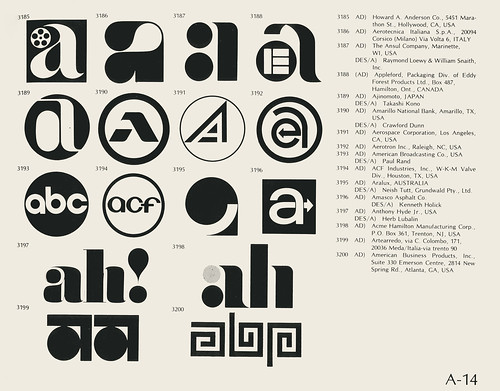
…on Flickr!
Saved from the scrapheap of out-of-printedness, you can view this “Collection of vintage logos from a mid-’70s edition of the book World of Logotypes” entirely in your Web browser. Oh, right, here’s the link:
Vintage logos
Is there anything Flickr can’t do?
via Daring Fireball
Wednesday, March 12, 2008
Flickrvision
via popurls
Do you use Flickr? I use it a lot when I'm pressed for time to create topic-specific graphics. Via Creative Commons license, many Flickr users grant rights to their photography for non-commercial use.
Using the search tool to find specific images is fine for work, but what about when you want to relax? With Flickr?
Flickrvision.
Just try it.
Friday, March 7, 2008
Got Photos?
Though this post should probably rightfully be Kathryn's scoop, I'm gonna be first off the block.... to, um, scoop... (Mixed metaphors are my specialty.)
If you are looking for cleared UC Berkeley images for non-commercial use, check this new site. UC Berkeley Images: UC Berkeley Photos. What's interesting to me is the photographer's credits! I was surprised at how many of our fine colleagues working in other fields on campus have contributed to this nice catalog of pictures.
Very handy.
Saturday, February 23, 2008
Design Police Directives
This is a bit dry. But, perhaps because I work for the police department and I am the designer, and have been calling myself the Design Police... it seemed like it was my duty to post this.
The Design Police Directives
Imagine you're Art Directing a new piece and are reviewing the draft. You could use these red tags to markup the doc. Not that you would. But do you ever think that sometimes a strict voice of authority is what you need to keep your design on track?
(Clicking gets multiple downloads of a PDF version of what you see when you click through the pages. That's a bit annoying. Stay with Next and Previous. Who knows what the address form is for.)
Thursday, February 21, 2008
Ever want to wear XRAY specs?
What would you see if you looked at your web page? Its skeleton? In this case, its CSS backbone.
If you edit or create your own style sheet, study other style sheets, or just wish you had started knowing what that was all about already, you must check this out.
XRAY
There's info about browser compatibility, but I can tell you it's seamless on today's Safari for the Mac.
See that XRAY button in the middle of the page? Drag it into your Bookmarks Bar. Yeah. Really. Then go to a page you want to XRAY. Pick any page, it really doesn't matter. Then click on that Bookmark Bar XRAY link.
A window appears. Follow the instructions. Suddenly you're in a world where code talks to you while showing you what it does.
Click the x in the upper right hand corner of the dialog box to come back to the world of the living.
Wednesday, February 20, 2008
A4 papercut

via popurls
It’s amazing what you can do with one sheet of A4 paper.
Scratch that. It’s amazing what Peter Callesen can do with one sheet of A4 paper.
I really can’t say anything more than, “Take a look at Peter Callesen’s A4 papercut online.”
Damn.
Thursday, February 7, 2008
Tech Company Logos
via popurls
Some of you may remember what the original Adobe logo looked like, but how many of us could pick Canon's circa 1934 logo out of a lineup? (Considering the company’s name was Kwanon at the time, not many, I’d wager.)
For your tech logo edification, click over to Neatorama’s The Evolution of Tech Companies’ Logos. You might be surprised at the early corporate identities of many (now-)familiar names.
Friday, February 1, 2008
Wrangle Type Design for a Style Sheet
Found a handy dynamic interactive type renderer to help you see what those various standard OS typefaces are capable of if given the right leading, tracking, word space and decoration treatments.
Visit Typetester to quickly see and compare on screen.
Neat-o.
Visit Typetester to quickly see and compare on screen.
Neat-o.
Wednesday, January 9, 2008
Decapitated advertising
via popurls
File this one under guerilla anti-advertising.
If you’re squeamish about bloodied, headless, bus stop advertising, DO NOT CLICK THIS LINK -->> The Decapitator Flickr set.
(I clicked it—and thought it was great!)
File this one under guerilla anti-advertising.
If you’re squeamish about bloodied, headless, bus stop advertising, DO NOT CLICK THIS LINK -->> The Decapitator Flickr set.
(I clicked it—and thought it was great!)
All Signs Say Paul Rand

I was poking around online for some inspiration (always a fun way to circle a task), and I was led, breadcrumb by breadcrumb, to this site about Rand that is the work of Daniel Lewandowski of Atlanta.
Here's what Lewandowski has to say about Paul-Rand.com:
"This site is meant to honor and pay utmost respect to the life and work of Mr. Rand. When I first began this project, I discovered that there were no “single-source” references to Mr. Rand or his works anywhere on the internet. Thus sparked the idea to build this tribute/archive site. I am in no way a philosopher or critic of design but have a great respect for the history of our industry and the people who have shaped it. In the course of building the site, I’ve been able to more greatly appreciate their thoughts and theories on design and develop my own opinions on the subject."
---
There's a dearth of images in the galleries as of yet, this looks like a work in progress, but I was drawn to this page of writings and video interviews that might be of general interest to us design types.
I particularly liked the interview with Steve Jobs about working with Rand for the NEXT logo (logotype?)
Thursday, January 3, 2008
Learn to type and type faster
via popurls
What does typing (as in using a QWERTY keyboard) have to do with design? Well, since computers are both the main design and communication tool for graphic designers today and the keyboard is one of two primary ways to control computers… uh… that’s what typing has to do with design.
Anyway, if you don’t know how to touch-type or you’d like to type faster, check out Learn How to Type Faster With These 8 Sites at mashable.com.
And, Happy New Year!
Subscribe to:
Posts (Atom)